Today I printed some a3 test pieces for the lining of my box, alike to
opening a shoe box and having your shoes wrapped in thin tissue paper I
want my products to be wrapped in a similar fashion. I used my logo to
create a repeat pattern that would be appropriate in keeping my design
consistent and tested out printed on some tracing paper. I think its
worked really well, i like the combination of the 2 different designs I
produced when laid over the top of one another.
Tuesday, 15 November 2011
Trying out my spot varnish technique
I was lay in bed thinking of ways I could spot varnish a piece of print
without spending loads with a print company or buying in special
materials, I thought of using clear spray paint and a stencil, PVA glue,
sticky back plastic but the idea that seemed most logical was using
clear nail varnish. I applied the nail varnish to a black on black print
of my logo using a paint brush and the results actually turned out
really well.
Black print on black sugar paper. Digitally printed. Photograph doesn't quite capture how it truly looks.
This is the black print on black paper with nail varnish ontop, Again the picture doesnt do the nail varnish much justice, without a bright camera flash if the nail varnish catches the light it looks almost like the real thing.
Designing and building my box
The main housing for my spray paint starter guide was the first thing people would see when looking at it, therefore I wanted to make this as intriguing as possible. My designs are below, I thought of lots of various ways of housing my product, but I came to the conclusion that rather than having it made from paper based/card based stock I wanted to use a different material so that it contrasted with the mainly printed products inside. I decided that the inside tray would be made from wood, and then the wrapping would be a paper sleeve. below is my development.
To make sure that the width of each piece of wood was 8mm thick I used some crazy piece of machinery below.
A few of my designs/ideas;
Preparing my wood for the assembly of my box
To make sure that the width of each piece of wood was 8mm thick I used some crazy piece of machinery below.
Sunday, 13 November 2011
What my starter Kit is hopefully going to include
As I outlined a couple of posts below My spray paint starter kit is going to include a wide range of products exploring a diverse range of print. Here's a list of the things I intend on making;
1 X HOUSING/BOX

1 X STICKER PACK

1 X CAP BOX

3 X MINI BOOKS

1 X SPRAY CAN WITH WRAP AROUND MINI GUIDE

1 X LEGAL WALL POSTCARDS
3 X PEN PACK
1 X POSSIBLE BALACLAVA
1 X HOUSING/BOX
1 X STICKER PACK
1 X CAP BOX
3 X MINI BOOKS
1 X SPRAY CAN WITH WRAP AROUND MINI GUIDE
1 X LEGAL WALL POSTCARDS
3 X PEN PACK
1 X POSSIBLE BALACLAVA
Peer Feedback 9/11/11
The peer feedback from today's session is below, Some good points where made and i realise the stages i need to go from here.
Things taken from peer feedback;
- I need to define a tone of voice, In what way am I going to communicate the information I'm presenting.
-What the content of my book is going to be, I.e What going to go on each page?
-Continue to build on experiments, mock ups etc.
-Colour considerations?
Things taken from peer feedback;
- I need to define a tone of voice, In what way am I going to communicate the information I'm presenting.
-What the content of my book is going to be, I.e What going to go on each page?
-Continue to build on experiments, mock ups etc.
-Colour considerations?
Tuesday, 8 November 2011
Packaging Design- The housing for my kit
A few sheets illustrating how I want my box housing for my kit to look. I
really like the idea of printing onto acetate windows and having some
sort of folding or sliding device, I think this will add character to
the asthetic I'm going for, that being quite dark and sneaky.
Print Considerations/Ongoing Progression
After getting my idea's flowing and getting some consistent direction to
what the final outcome of my work will be I started to re-think and
re-design my logo. Previously I had already made my logo vector In
illustrator but after getting a feel for my project I just don't think
it represents it very well, so therefore I started to re-consider Ideas
for modifying/changing it. Rather than my other logo I wanted this one
to be much more clean cut and straight forward, If this would be branded
across the range of my different products It would make it appear much
more consistent.
Here are a few of my initial ideas, before taking my drawings Into illustrator.
Stock Experiments: I want to use a stock that really communicates what my project is all about. Graffiti and spray painting are taboo subjects from a regular stereotypical person, therefore the act of going out spray painting is a sneaky and subtle mission that usually goes underway at nighttime. i want my colour of my stock to eventually represent this and be quite grungy and dark.
The black on balck print below is my favourite so far, the matt tone of sugar paper and the glossiness of the black ink compliment each other.
Design Sheets/Ongoing Progression
After having my tutorial during reading week I realized my project was lacking a lot of different things and there were area's that needed researching and thinking about properly. I hadn't grasps the fact that we could push the boundaries of our work in whatever direction we wanted and all I needed to do was to think a little more outside the box.
I still want to produce a guide to spray painting, However by producing lots of drawings and sheets I have come to conclude that I want to make, a sort of vandalism starter pack, or a taboo guide to spray paint. This would take shape shoebox size, or to a similar format and contain guides/tips/tricks/help on spraypainting, covering the main aspects of graffiti such as techniques, paint, caps, evading police etc. Take it with a pinch of salt.
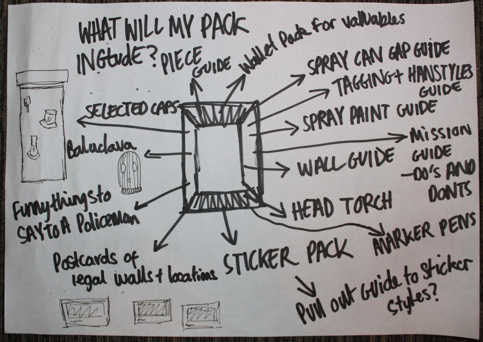
What will My pack Include (Possible Ideas);
-Wallet pack for valuables,
-Spray Paint Guide
-Tagging/Handstyles Guide
-Head Torch
-Do's And Dont's guide
-sticker pack
-Postcards of Legal Walls
-Marker Pens
-Caps
3 Books
My Three books will be the main aspect of my starter pack, They will cover Caps+Tags, Cans+Walls and pieces+techniques, 2 subjects per book split into 3 books. I want them to all have the same aesthetic feel, using dark colours, and possibly a repeat pattern etc.
Stock Considerations
200GSM front cover, or possibly thicker,
100GSM inside pages, possibly thinner, depending on how my experiments work.
Caps
As I wanted my pack to teach the techniques of spray painting, one of them being how to manage can control and how to use different caps I wanted my pack to contain a selection of different caps for people to experiment with and use.
Below is a few ideas of how I would want to house my caps, remembering to keep consistent with my 3 books and remain as simplistic but effective as possible. I thought an acetate window could be manipulated in various different ways so that I could present my caps in an interesting way.
Sticker Pack
My target audience is going to be males and females aged 17-25 from a creative background who have an interest in starting spray painting, What better way to advertise my brand than giving them a sticker pack to slap my logo around towns and cities. When I drew the 150 logos earlier in the project There was so many others I was happy with and would like to push further forward, by making a sticker pack this will give me the leeway to do this.
Balaclava
A screen printed balaclava with my repeat pattern or logo printed onto the material, My plan is to get a net of a balaclava to start with and see whether it would be plausible to make.
Hidden Pens
In my pack I want to include a range of pens for my customers to use after they've read my tagging guide. Here are a few innovative ways I thought i could disguise them.
Tips and Tricks Cards
Glossy, playing card style handouts with information on paint tips, techniques, what to look out for etc.
Print considerations, A1 print, with all my cards on one sheet, glossy, 240GSM.
Dry Wipe Blank Book
The main way you're going to get good at developing a hand style is writing, writing and writing some more, and nobody wants to be wasting piles and piles of paper. I thought A blank dry wipe tagging book would be a good tool to use for people to practice writing their name/moto over and over again without creating any evidence for police to find and without becoming surrounded by lots of scrunched up pieces of paper.
Print Considerations- Blank Acetate front cover, 160-200gsm card, Digital print for front cover or possibly pad print.
Hand Gel
There's nothing worse than walking into your house and your parents commenting on your fingernails being covered in spray paint. I thought an ideal way to cope with this problem would be to give out a hand gel in my pack that removes spray paint easily and works similar to an anti-bacterial hand gel.
The main aspect of my promotional material is my wrap around cap sleeve for spray cans. This would be a sleeve of card/paper that will wrap around cans that are being sold in paint shops, It will have some quick tips and guides on a selection of 5/6 caps with a link in the bottom right hand corner to my brand gloss and other products available. I thought this would be ideal to appeal to the right auidience (people buying paint) plus as there isn't anything to do with caps on any spray cans I've researched so far I think this would definitely get people reading.
I still want to produce a guide to spray painting, However by producing lots of drawings and sheets I have come to conclude that I want to make, a sort of vandalism starter pack, or a taboo guide to spray paint. This would take shape shoebox size, or to a similar format and contain guides/tips/tricks/help on spraypainting, covering the main aspects of graffiti such as techniques, paint, caps, evading police etc. Take it with a pinch of salt.
What will My pack Include (Possible Ideas);
-Wallet pack for valuables,
-Spray Paint Guide
-Tagging/Handstyles Guide
-Head Torch
-Do's And Dont's guide
-sticker pack
-Postcards of Legal Walls
-Marker Pens
-Caps
3 Books
My Three books will be the main aspect of my starter pack, They will cover Caps+Tags, Cans+Walls and pieces+techniques, 2 subjects per book split into 3 books. I want them to all have the same aesthetic feel, using dark colours, and possibly a repeat pattern etc.
Stock Considerations
200GSM front cover, or possibly thicker,
100GSM inside pages, possibly thinner, depending on how my experiments work.
Caps
As I wanted my pack to teach the techniques of spray painting, one of them being how to manage can control and how to use different caps I wanted my pack to contain a selection of different caps for people to experiment with and use.
Below is a few ideas of how I would want to house my caps, remembering to keep consistent with my 3 books and remain as simplistic but effective as possible. I thought an acetate window could be manipulated in various different ways so that I could present my caps in an interesting way.
Sticker Pack
My target audience is going to be males and females aged 17-25 from a creative background who have an interest in starting spray painting, What better way to advertise my brand than giving them a sticker pack to slap my logo around towns and cities. When I drew the 150 logos earlier in the project There was so many others I was happy with and would like to push further forward, by making a sticker pack this will give me the leeway to do this.
Balaclava
A screen printed balaclava with my repeat pattern or logo printed onto the material, My plan is to get a net of a balaclava to start with and see whether it would be plausible to make.
Hidden Pens
In my pack I want to include a range of pens for my customers to use after they've read my tagging guide. Here are a few innovative ways I thought i could disguise them.
Tips and Tricks Cards
Glossy, playing card style handouts with information on paint tips, techniques, what to look out for etc.
Print considerations, A1 print, with all my cards on one sheet, glossy, 240GSM.
Dry Wipe Blank Book
The main way you're going to get good at developing a hand style is writing, writing and writing some more, and nobody wants to be wasting piles and piles of paper. I thought A blank dry wipe tagging book would be a good tool to use for people to practice writing their name/moto over and over again without creating any evidence for police to find and without becoming surrounded by lots of scrunched up pieces of paper.
Print Considerations- Blank Acetate front cover, 160-200gsm card, Digital print for front cover or possibly pad print.
Hand Gel
There's nothing worse than walking into your house and your parents commenting on your fingernails being covered in spray paint. I thought an ideal way to cope with this problem would be to give out a hand gel in my pack that removes spray paint easily and works similar to an anti-bacterial hand gel.
Promotional Material
The main aspect of my promotional material is my wrap around cap sleeve for spray cans. This would be a sleeve of card/paper that will wrap around cans that are being sold in paint shops, It will have some quick tips and guides on a selection of 5/6 caps with a link in the bottom right hand corner to my brand gloss and other products available. I thought this would be ideal to appeal to the right auidience (people buying paint) plus as there isn't anything to do with caps on any spray cans I've researched so far I think this would definitely get people reading.
Monday, 31 October 2011
Grahams Type Session 2
Type workshop
Kerning- The space between 2 or more characters. The area that lies in-between. Making our diction sound gorgeous.
Why do we need kerning?...To insert a consistent white space in-between letter forms.
Letter spacing and kerning is literally making a set of letter sit comfortably on a page by altering the white space in-between a set of letters in a word.
In terms of branding kerning has to be perfect because one word logo’s need to attract the attention of custom.
When editing kerning you start with is the space which is the largest space in between two letters in word.
Kerning- The space between 2 or more characters. The area that lies in-between. Making our diction sound gorgeous.
Why do we need kerning?...To insert a consistent white space in-between letter forms.
Letter spacing and kerning is literally making a set of letter sit comfortably on a page by altering the white space in-between a set of letters in a word.
In terms of branding kerning has to be perfect because one word logo’s need to attract the attention of custom.
When editing kerning you start with is the space which is the largest space in between two letters in word.
A system or organization in which people or groups are ranked one above the other according to status or authority.
The eyes work separately to your brain when reading, You don’t necessarily view something how you think it to be viewed, don’t let your eyes kid yourself.
You eyes are firstly draw to words on a page that have the most negative space around them.
It is impossible to look at your work for more than 10 minutes without going crazy in your own mind, thinking words are spelt wrong etc, Make sure you get someone else to check through.
Task-Write down a line from your favorite song, and arrange it how you want it to be read.
How do you break a sentence into two lines?
The rule of breaking a sentence, you always break the sentence where the natural pause is always speak a sentence out loud before attempting to break it.
TASK