Sunday, 20 November 2011

Postcards


Below is the design development for my legal wall postcards, my final four chosen places are Lakeside Essex, Burley Leeds, Southbank London and the Pit in london. Here are a couple of pictures of my layout considerations.


To link in with the finish of my spray can sleeve I decided to use the same stock, 120gsm glossy, I thought this was most appropriate for the making of a set of postcards.


Layout on Illustrator

Back Of Postcards 
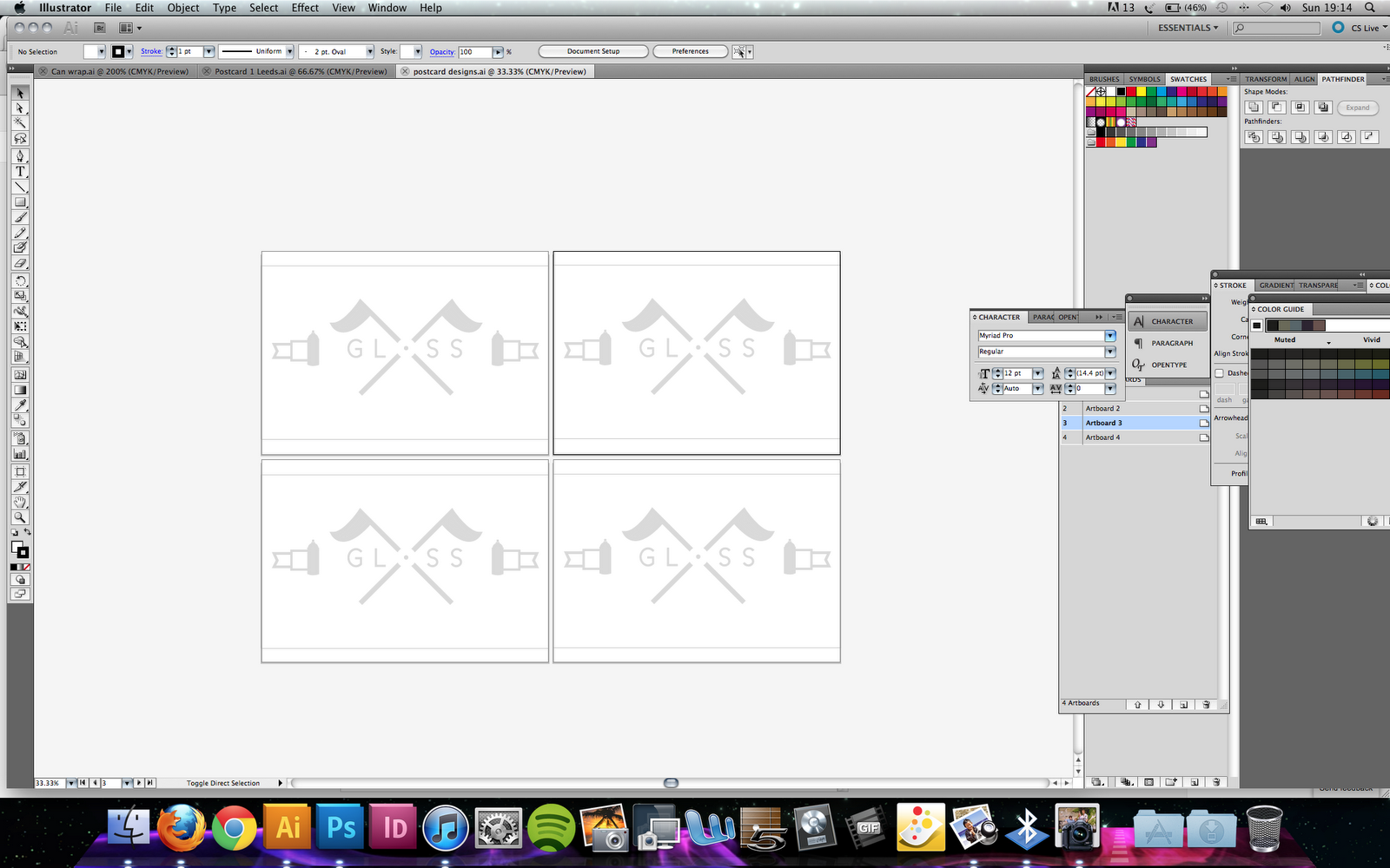


Front of Postcards 


Print considerations

As this was the first thing I would be printing at home I wanted to make sure that my photographs on each postcard didn't loose any colour saturation and still stayed as vibrant as they did on screen. After a few tests printing I got the print looking almost exactly how I wanted it to, had to buy a new set of cartridges though!


My finished Postcards Front + Back


Mock up book

For the design of my final book, I wanted it to be around the size of an A6 piece of paper when folded. Below are a few photos of my mock up book I made.


Sticker Sheet

Within my pack would also be a couple of sheets of stickers as a way of promotion for my branding yet at the same time being a nice sample of print which is nice to keep. I wanted to keep the design of my sticker sheet as simple as possible and use all the logo's that I'd been playing around with earlier in the design process. This is the development for the making of my sticker sheet.


I printed my sticker sheet on 120gsm Gloss paper as I found it really hard to get hold of my own sticker paper before the deadline of the module. However I feel this still gives a good representation of what I would have done with more time.


Spray Can Sleeve

My original Idea was to make just a spray can sleeve as a fold out guide and since moving away from just that Idea I still want to use and include it within my box, I want to keep the design of it as simple as possible to remain consistent with the rest of my work. A couple of designs are below followed by the devlopment towards my final design.


Stock considerations


So far Ive only used matt black when it comes to printing and I wanted to mix things up a bit in terms of contrasting the different products that would be visible in my box. I thought the best choice of stock for my spray cans would be a glossy print. My final print is below.


Testing out stocks for the sleeve for my box


After completing the lazer cutting part of making my box I wanted to bring it all together by making a wrap round paper sleeve. I thought this would really give the box a finished quality rather than just looking like a lazer cut draw, and after all this is a print module not a wood making one haha.

Here are a couple of mock ups of how i wanted my sleeve to look like when wrapped around my box.


 Earlier I had tried out some spot varnish techniques using nail varnish, I wanted to use this aesthetic feel on the exterior of my sleeve however keep the spot varnish as crisp and clean as possible. I'd heard of printing a sheet of film down in the digital dungeon to create the same effect however costings would be my main issue in terms of printing. Instead I bought some clear foil from printed textiles that when put through a laminator with a piece of print would leave a clear film on the printed areas. Below are a couple of my samples, I used a variety of black stocks to tie in with the branding of my product.

Black Print on black sugar paper+clear foil


Black Print on black cartridge paper+clear foil


I decided to use the black on black cartridge paper as the finish was much more subtle and didn't look as pale as the sugar paper print. It works well because you dont catch the reflection of the varnish from all angles, this is exactly what I wanted to achieve, god thank the laminator in the library!


Making my sliding box/draw Lazer cutting

When I was designing the lid for my box I wanted to laser cut my logo into the roof of the housing so you could see the products that it contained through the gaps in the wood. After getting to grips with the laser cut machine from being shown by one of the furniture making students It was a lot harder than I thought and there were many more considerations that I hadn't expected. Laser cutting has 3 main processes, cut-through, raster and engrave, and positioning your image on your wood when you're useless at using measurements was a rather tricky task. As I wanted to be able to see through the wood into my box the option I was working with was cut-through.

Some of my samples are below, working mainly with engrave and cut through on 6mm thick ply wood. 


Finally when I got my logo positioned in the right place and I was happy with the way it would be cut I completed 2 final lids for my box, one engraved and one cut through.

Cut-Through


Engraved


Here's a Video of the laser cutter in action, cutting my lid, I realize the video isn't amazing but it was filmed on my phone.


Making my sliding box/draw

After spending time in woodwork and getting all my wood cut down to size and visualizing my box 3d rather than down on paper It was time to start assembling what I was making. I used some wood glue and small nails to tack the corners together then left them in clamps overnight. Heres a few pictures below of where I'm at so far...


I previously printed some samples in the mac suites using tracing paper and a couple of repeat patterns I designed. I wanted to use them as a lining for my draw alike to the lining you get in a shoebox however when it came round to putting the print in my box I found it looked much better cut out and stuck to the walls of the interior.  This is just another littler perk to link all the areas of my branding together, plus it also distracts attention from the plywood bottom, which isn't the nicest of colours or wood finishes.


Final Crit

Main points brought up;
-I need to focus on what tone of voice I'm communicating.

-Carry on making mock ups for my final pieces.

-Start building my final piece as time is short, focus on the practical side rather than on the contextual side of things.


Tuesday, 15 November 2011

Presentation boards

Below are some rough sketches of what Im planning to put on my presentation boards when it comes round to the module hand-in. I want to communcate to whoever marks my work the outlines of my project, how and where I started and what processes I went through to get to the final stages.

1. Concept + Backing + Rationale
2. Contextual Resarch Page
3. Final Piece photos (all products together)
4. Printed Products ( Processes)
5. Other products I've made. 


Designs/Ideas for my Balaclava

My balaclava was going to be something that I took into consideration if I had some extra time on my project or found I could fit it in with printing my books, however when passing the market today I managed to pick up a plain balaclava for £3, Bargain! I cut off all the thinsulate tags and I've come up with a simplistic way of branding my product without cutting into my time limits. I had had ideas of screen printing the whole of my balaclava however with the nature of the fabric I don't think this will be achievable. However the idea the idea I'm working with is producing a small tag/badge that will be sewn on. Ideas/mock ups are below.

Rough Ideas


Final Colour Scheme

As I'm coming closer and closer to printing my products and starting to brand everything in the same way in terms of design I needed to finalize what colour scheme I am going to stick to. I've come to the conclusion I want to use quite dark shades of grey and black and blue, with the possibility of some bright spot colours like orange and green.