Wednesday, 7 November 2012

The Universes Pupils // Identity

Again working with my brands Identity I wanted to produce a logo that could be used across a series of shirts and across labels and tags, I thought hand-drawn communicates simplicity but at the same time communicates hand-made. Below are a series of my developments.


From my research into impossible shapes I began to draw and arrange some of my illustrations below of interwining shapes, so I could house my logo.


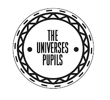
This is my final Logo, Re-working the word pupils so that it fits in the with word 'the' and Universes so that my logo makes a shape in the patterns of the letters.

The Universes Pupils // Concept Boards & Crit

Feedback Sheets


The Universes Pupils // Branding & Type Experimentation

Digital Experimentation
So far My ideas for the universes pupils have stemmed form lots of different places. I want to communicate a clean minimal identity to represent the company as being cleant and attentive to the finer details in terms of clothing. I wanted to use a sans serif typeface and create a logo that could be universally used across tags and labels.


Below are screenshots of some of the digital experiments I've been working on, experimenting with layout and how the word brand reads as a whole and separated out into three different lines.

Layout Ideas/Form


In terms of weight and stoke, I want my logo to be quite thick so that when screen printing the letters are clear to read. The Weight I've chosen to use is 4pt as seen in the very bottom example below.
The ideas below show my experimentation with exposing and restricting areas of my type, I think this negative and positive space makes your mind think more about where the hidden parts of the letters would be. The Universes Pupils is about being open minded and equal, I like the idea of getting my audience to almost subliminally think about the space in a logo.


The Universes Pupils // Concept Devlopment

T-shirt Ideas/Cuts

I wanted to strip my ideas down as much as possible as I find I often think about design way too early within a brief rather than concept building. The Universes Pupils is going to be a brand that uses ethical materials and ethical modes of production but I want the fabrics and materials themselves to be just as interesting as the prints themselves. Below is a few sketches and considerations I've been putting together to manipulate my material, thinking openly, What happens if my shirts are cut in half then re-sewn to other colour shirts? What happens if my sleeves are turned up and sewn? What happens if my sleeves are taken in to make the torso more of a muscle fit? etc.


Below is a list of different concepts for each shirt. I want each shirt to be associated with the next with consistent branding and tags etc, but each t-shirt design to be completely different. I don't like companies that create one logo and use it across everything, I feel as if I have so much I want to cover with my brand that this would be far to restricting.

One of the idea's I've come up with that I feel is quite strong is a design based around a play on the word pupils. Pupils reminds me of teaching and teaching reminds me of detention, looking into lines and repetition of words on a chalkboard is something I want to play around with.


Idea generation/Concepts

Below are some of the concepts and Ideas I've generated in relation to my personal brief, where I'm printing my own range of clothes. I've come up with an overall blurb about the sort of ethics and attitudes I want my clothing company to have. I want THE UNIVERSES PUPILS to become much more of a collective rather than another generic street brand, I want it to be affordable and communicate equality both in production and design.

I'm keeping THE UNIVERSES PUPILS all uppercase with no punctuation marks. The reasoning for this is outlined below, If the word UNIVERSES contains an apostraphy it means the word PUPILS belongs to it and Vice Versa. I want this to be an underlying message...Do we Belong to The Universe Or does the universe belong to us?

Use an apostrophe after the “s” at the end of a plural noun to show possession.
The parents’ bedroom, the Joneses’ lives

It is not necessary to add another “s” to the end of a plural noun.

If a plural noun doesn’t end in “s,” add an “‘s” to create the possessive form.
The children’s rooms

*Remember, a possessive noun needs an apostrophe and an “s” at the end. If there’s already an “s” there, you can just add the apostrophe. If there’s no “s,” you have to add both - first the apostrophe, and then the “s.”


Logo GenrationLogo design and Identity are going to determine to message I give across, I've picked out a lot of key aspects I want to communicate through my branding so I can start to consider typefaces and letter forms etc. How are people going to interpret the words...THE UNIVERSES PUPILS.

When I came up with the name 'THE UNIVERSES PUPILS" I thought this was appropriate to a clothing company that wanted to expose current world issues and promote messages that gets its audience thinking. THE UNIVERSES PUPILS categorizes not just a single group of people but the title itself is talking about everybody...because essentially we are all are the Universes Pupils.


Monday, 22 October 2012

Collaborative Retail Graphic Brief: Urban Outfitters

Me and Sadie spent a considerable amount of our time plan going around different stores and chatting to their owners about their shops as a space, and how they organize a layout to represent the image they want to sell. Looking at both high street commercial stores and smaller independent brands. We aimed our focus on Urban Outfitters as they're a store that always seems to have art installations and projects going on.

We had alot of positive responses, mainly from smaller shops, however Republic gave us the details to their head office and showed us a few spaces we might have the chance of working with. Obviously our subject matter would change drastically working with a store/brand like republic but having the opportunity to work with such a big name would be a shame to turn down.

After pursuing a few emails between different stores and managers, we concluded that the process of finding our location to produce our installation was becoming very lengthy as getting in contact with the right people was a difficult task.

Out of pure luck I got talking to the manager of a Bar off Millennium Square called Escobar, which is both a bar and a mexican restaurant. After explaining some of the ideas me and Sadie had for our collaboration he agreed that we could base our project on his restaurant re-doing the way finding on the walls and artwork.

In terms of a client he was really straight forward and open as to what he wanted doing, The consistency of the mexican theme throughout the restaurant was his main concern. We have been given two main areas to work with, one being a re-vamp of the mexican map on the resturant wall and corresponding artwork around it.

Photographs of the space we've been given to work with are below.


Sugar Skulls and Escobar


Initial IdeasBelow are just some quick Idea's I started to play around with, photocopying and drawing different bones and playing around with layout. I found this was just a quick way of generating visual ideas when brainstorming with Sadie.


Trip To Urban OutfittersUrban Outfitters really intrigues me, purely because there's constantly something that catches your eye as you walk around their clothes. This constant grasp of interest takes your attention off the experience of purchasing something and it feels more like the combination of looking round a gallery and buying clothes. In relation to the opportunity we've been offered at eEcobar we need to produce work that reflects the restaurants menu, food, history and atmosphere.


Below is a Job application which me and Sadie considered emailing Urban Outfitters about, the role is for a merchandize manager dealing with the layout of the store. We thought if we proposed some of our ideas to them this could be a really good way of getting involved with a big store.

Collaborative Retail Graphic Brief: Initial Drawings

For mine and Sadie's collaborative brief we are looking at animal and human anatomy and mechanics in relation to a shop installation piece. As these are just initial concepts of subject matter we got hold of a few animals skulls to produce some drawings and start to gather ideas. I really like the idea of working with bones and anatomy however our audience and context needs to be decided on to inform our design.


Sunday, 5 August 2012

Start Of 3RD Year

Start Of 3RD Year