Wednesday, 28 November 2012

The Universes Pupils // Screenpirnting

For the past week I've been in screen print getting on with the printing of my garments, So far I've found it really difficult getting right consistency when using the printing inks and I've managed to ruin a few t-shirts. However some of my friends from printed textiles have been helping me out to get the most out of the screens I've prepared. I've prepared 2 so far, one for smaller logo prints and one for the bigger all-over prints.


I was really happy with some of the screen printed labels i did, However I found it really hard to get a thick consistency of ink to pull well through the screen.


The Universes Pupils // Contuining Branding

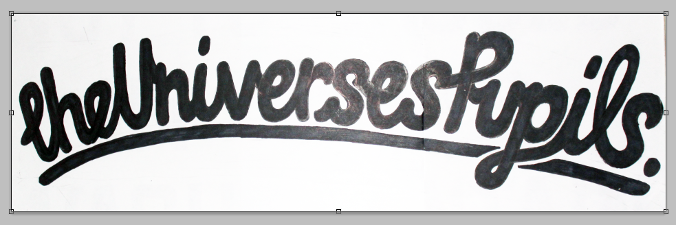
So far I've produced a lot of different approaches to branding the universes pupils and I think the hand drawn scratchy logo really helps to communicate an overall taste of What The Universes Pupils Is all about. Below I started sketching out a logo that could be used across another series of t-shirts, producing a very swirling and flowing set of letters to create a logo that would sit nicely across the right breast of a t-shirt or print on the reverse.

I hand drew the logo below on a sheet of A3 paper so that I could maximize its quality when working in Photoshop and illustrator to sort out its proportions and scale. You can see a significant change between taking it from hand drawn through to digital.


Below are some experiments I completed, working with camouflage and space imagery.


Tuesday, 27 November 2012

Escobar Cantina // Informative Plaques


 In the area we've been allocated to work within Escobar, the old artwork on the walls depicted a mexican map with facts about Mexico around the outsides. I wanted to continue this idea, making me think about admiring small pubs that are covered with things for its customers to look at, the plaques I've designed above are some quirky interesting facts about Mexico that can sit beneath our map for customers to go up and read. I divided the facts I collected into 3 different sections so that the plaques could work as a three but still be easily categorized. I chose to use the display typeface Homestead across all of the pieces we produced for Escobar, and the body copy as Rockwell, I thought these two typefaces complimented each other whilst fully serving their purpose. Below is a few of my typographic experiments playing around with layout, point size, kerning etc.


Escobar Cantina // Varnishing & Finishing Plaques


The Universes Pupils // Inner Labels


I designed the labels for the inner sleeves of my garments in the same format as my swing tags, using perpetua and a short intriguing poem/strap line to keep my audience engaged and get them to notice the connection between the two parts of the overall product. I added washing information that applied to the fabric I bought, and used a black letter decorative typeface to show what size each garment was. I thought the combination of the two typefaces made the size really stand away from the page.


The Univerese Pupils // Stickers

Alongside my clothing and labels, I wanted my t-shirts to be sold as a package including stickers and other accessories.


Escobar Cantina // Plaques

Below are some plaques I've designed to sit alongside our other artwork and main map piece, I collected royalty free images of Mexico relating to different aspects the restaurant wanted us to include. Using the typeface Homestead alike to the other plaques, I then worked into 2 of the images to create the restaurants title. Working with images that had been set to grey scale and saved as a JPG allows the laser cutting to recognize the image as just thousands of shades of grey, rasterizing the image into wood with a laser near enough exactly how it is seen on screen. 


Escobar Cantina // Map


Escobar Cantina // Wooden Samples & Laser Cut

The Universes Pupils // Kalidescope

Alongside all of my printed media, I want to create some online and digital promotional material. Below I have created a Facebook where my target market and audience can view and look at items, with links out to an online shop and website. I produced the motion graphic below as part of some promotional material thinking about how my audience would find out about release dates and when new ranges would be available to purchase.

I took a series of different illustrations I'd produced and mapped them to a kaleidoscope program. I want to develop this video so that the dates of my release will appear to the transitions in frames and so that the song below matches the motion of my drawings.


Escobar Cantina // Mexican Sugar Skull Drawings

Escobar Want me and Sadie to Produce some wall pieces to correspond with our Mexican Map, As the restaurant is Mexican and they want to use a lot of colour we decided to Look at the Mexican day of the dead, A celebration of the deceased, looking at sugar skulls and skeletons. Below are 3 Illustrations I produced looking at the human skull and mexican Patterns, Contrary to how I usual work I produced my drawing in three layers so that it would be easy to separate on Photoshop, one single line drawing, one of the fill pattern and one of the shading done in dots.

These will eventually be taken to laser cut experimenting with cutting the designs into wood.


 Below are a series of different colour experimentation pieces, just using my illustrations as complete set of layers but changing the tone of each layer. Eventually we will be taking these to laser cut to experiment with how they look cut out in wood.