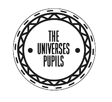
After completing our 150 logo designs, we were asked to choose a final ten that we thought were most visually appealing and communicated your product well. My Ten are below;
After picking the ten logo's i was most happy with we were split into groups and given the task of rating each others ten logo's so that we had a neutral decision of which one to go ahead with. The group that ended up with me picked the logo below for me to use. With valid reasoning. This wouldn't have been my intended logo of choice however it opens up more possibilities for me to work with as I'm not limiting my ideas and going with what I intended.

Groups reasoning...WHY?
-Most potential as a completed logo
-Can picture the logo on packaging etc
-The typeface used it pleasing
What? To Improve?
-Maybe look at adding image instead of just type.
-Make sure it remains visually consistent.
-Make sure it remains visually consistent.


No comments:
Post a Comment