For this weeks session we need to of chosen at least 4 briefs to start working with and digesting. One from DN&D, one from YCN, one from ISDT and one from another graphic competition brief. Below are the few I've picked out so far and why;
Graphic Competitions;
Hiiibrand.
Hiiibrand is a platform to exchange and creative ideas and practices of all creative people and teams. There are two sections to produce illustrations for and the brief remains very open in relation to final outcomes.
The published: Illustration works commissioned by agencies in the form of posters, ads, CD's, packages, books, magazines, newspapers and other publications.
The Unplished: Self-initaed commissioned but not published, personal or experimental work.
This briefs, gives me the opportunity to publish unpublished works in professional Publications.
Graphic Competitions;
President Design award 2012
Award recognises excellence across all design principles, Advertising design, visual communications, architecture, urban design, fashion design, furniture design, interior design, landscape design, product and industrial design.
I've found this brief very unclear, in terms of what they're asking people to produce. Designing the presidents design award (designer of the year, design of the year) envelope and mail out Is on of the first considerations I've thought about, however I don't feel this brief is very inspiring in comparison to the rest.
Graphic Competitions;
Cheltenham Illustration Awards
Celebrate the creativity and diversity of contemporary narrative illustration. Interpret the theme of "Tales Of Magical Themed Objects.'
Any Media, Any style, but my starting point has to be taken from the "Amulets and Charms" collection at the Pitt Rivers Museum in Oxford.
Single or multiple Panels, printed on A3 and digital.
I like the openness of the outcomes of this brief, I enjoy working in a range of media, and this brief would allow me to do so.
Graphic Competitions;
Time To design
The concept for behind the award is to give an opportunity for young designers to develop talent and skills under the best possible conditions.
What do you need in the beginning of your career as a designer. Looking back at my first year PPD presentation could be a good source of information, its a subject that I've experienced myself coming on this course.
Brief is very open, you can decide whether you want to apply a design proposal or whether you want to modify a more finished project but It has to be aimed at designers from all over the world at the start of their career.
Graphic Competitions;
The conqueror Typographic Games 2012
This graphic design and typographic poster competition issues a challenge of sport and on the phrase "It's not what you win, but how you conquer it."
Poster design? Image as type?
This brief seems far to open for me to work with, I like the overall message you are required to communicate but I feel I wouldn't keep a consistent amount of interesting tackling something like this.
Graphic Competitions;
Piracicaba International Humor Illustration Contest.
Mainly illustration, Producing 3 works around cartoon caricature and comic strips.
Not too keen on this brief, As I don't feel cartoons and comic strips are my forté. However Graphic art and digital painting could be an option to consider.
Mainly illustration, Producing 3 works around cartoon caricature and comic strips.
Not too keen on this brief, As I don't feel cartoons and comic strips are my forté. However Graphic art and digital painting could be an option to consider.
D & A D
Faber and Faber
Use typography to create a series cover designs for faber films range of books.
Target Auidience: Film professionals, film and media students, people look for a special gift for a film enthusiast.
This brief hasn't grasped my attention quite as well as the others purely because i enjoy working with Image more than working with type.
D & A D
Crisis
Create a piece of direct mail that raises awareness of homelessness and the work of the crisis homeless charity.
Hands on approach, lots of primary research, theres loads of homeless people in Leeds I pass everyday who could be a good source of primary research interviews etc. Main things to consider will be the tone of voice, as I am required to produce a piece of direct mail that should have a clear central idea, message and call of action to inspire people to contribute to the crisis charity.
Non humours, consider appropriate and interesting use of materials.
D & A D
Diesel
Create an illustrated interpretation of a musical track that is experienced by the viewer in an unconventional and pioneering way. Good link between my love for design and music, mixes two of my favourite interests. Exploration of music visually, would be nice to look into some of the patterns and shapes created by music waves.
I already have a good knowledge of how music is produced thanks to my flatmate who is doing music and playing guitar for 6 years. My initial thoughts are how programs visualise a sound wave, looking at programs like logic, audacity, traktor and cubasis.
Choose a band or artist and create an illustrated response inspired by two of their tracks. In doing so, you'll be facing the issue head on and demonstrating your vision of a brave new world for illustration in music.
D & A D
Little White Lies
Create an original illustration for Little White Lies magazine, depicting the main character of one of our five favourite films of 2011.
Starting point I would need to watch the films below; Drive, Black Swan, The tree of life, Super 8, Tinker, Tailor, Solider, Spy.
I need to incorporate the Little White Lies masthead into my design, Gives me a good chance to explore approaches to illustration. I'm not amazing with portraits but I feel this is a brief I could really get my teeth into.
Mandatory requirements: One illustrated cover depicting one of the five films listed above.
D & A D
Research Studios
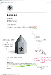
Re-launch fuze magazine, exploring type.
Could be a good extension of the work I produced in Image.
Editorial image and type. How can i showcase new typography?
Innovative thought provoking type- This is right up my street, Initial ideas could be working with mainly hand rendered typography and how type works as image. This is one of my favourite briefs so far.
D & A D
Don't Panic
Create an image for Don't Panic that captures the theme of resistance.
Themes: Going against the grain, going left when everyone is going right.
Don't panic is a unique free publication distributed in selected shops stores bars and art spaces.
Tone of voice: Socially active creative young people.
A2 suitable for reproduction.
I've collected don't panic for a long period of time already, I have a good selection of background material and first hand primary research already.
ISTD
It happened on this Day;
I really like this brief, as it tackles current and interesting politics. Access to data is so effective that we are now better equipped than ever to create information that expresses histories in the personal as well as the international forum.
Submissions should essentially be typographic, using screen print or combined media, interperting the theme it happened on this day. It could be an event or a story that has happened throughout history.
Subject matter Ideas so far: 911, SOPA, JFK shooting, the first man on the moon, roswell 1947, the day I was born, etc


No comments:
Post a Comment