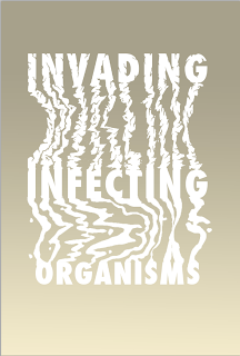
For this quote i wanted to just solely use some heavily manipulated type
to communicate the words chosen. I wanted to go with my initial idea of
having the word invading, merging into the word infecting and the word
infecting merging into the word organisms. The word invading could
relate to lots of different subjects that could communicate the word in
itself, I wanted to chop into the letters to make them appear that they
were almost like a rock formation invading into the letters below like
the weathering of a cliff-face. For the word infecting I wanted to use
the same general idea but to communicate infecting the letters would be
much rippled as if they were oozing into the word organisms. Below is
some of my development towards my final outcome. I started off working
with my type illustrator but brought it across to photoshop so I could
use some of the jagged edges brushes with my graphic tablet to complete
the look I was going for.

Once completing the main aspects of my outcome and getting the type to
sit on the page how I wanted it to I started to play around with a few
variations of colour. I wanted to use a fade to further communicate the
merging of the words I had chosen to use.
I used subtle pastel tones of brown and magnolia to create the fade in the backdrop, I found that most of the colours I used over the top of the fade worked considerably well even though realistically I was just using trial and error. Rather than using a solid shade I decided for my final outcome I would use some texture to give the words a bit more depth, my final result is below.


No comments:
Post a Comment