Monday, 17 January 2011

OUGD 104 Visual Language Type and Grid

This week with Lorenzo we looked at how type is recognized in papers and magazines and how they are acknowledged by their height, weight, tracking, kerning, readability scale etc. 

Tracking- the adjustment of letterspacing for words, phrases, and extended blocks of text. Tracking can be applied automatically by word processing and page layout software or manually applied to only portions of text to enhance readability, to fit more text in a column, or for special effects.

Definition: Kerning is the adjustment of space between pairs of letters to make them more visually appealing. It is normally applied to individual letter pairs in headlines or other large type.  


Below is an example of the way we identified what grids newspapers use to align the data they present. The columns are split up into different sections by the way the text is layed out and then separated by blank spaces called gutters.


Our next task was to re-arrange the layout above into some different layouts like below. 


Thursday, 6 January 2011

Collection of 100 OUGD102- Guitars

For my collection of 100 project i decided to base it on one of my main hobbies and interests, something that i would have a wide knowledge on and hopefully be able to  produce a vast amount of work around. I picked the subject of guitars initially thinking about looking into, peoples favorite guitars, the history of guitars, brands of guitars, tabliture and sheet music, guitar idols, vintage posters etc.

I started by posting on my facebook a question for my friends to respond.
If you could own any electric guitar in the world, what guitar would you choose?
 

After getting an idea of what my friends favourite guitars are i decided to start digging a big deeper into graphic design terms relating to guitars. As my dad is also a guitar player and has been for a long time i managed to acquire some old guitar identification books relating to branding and logos within guitar playing.  Below are some scans from a couple of the books i found. 
 This front cover works really well in terms of colour, i like how each individual guitar neck has been given a pale aged tone of either orange, red or yellow because they reflect the period of time that the book was made and they compliment each other against the fading blue background.


 These old headstocks really interest me, especially the way the type works with the shape of the headstock, tuning pegs and nut. This is definitely something i would like to research further and develop into my own work.


I really like the retro feel of the pages in the books especially the front covers (top and bottom image.) The colours of the pink in the image above and the singular line illustrations makes it look very electronic especially with the crosshatched background. I like the way the layout has been assembled with everything at an unusual spacing and not exactly centered or aligned.


Manchester- Sound Control
A few pictures from a visit to one of my favourite guitar shops.


Pictures Of My Own Guitars/Amplifiers
A few pictures of a few of the guitars that me and my dad own between us.
 Gibson SG in Cherry Red

 LTD MHQ-1000MT

Hoyer

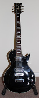
 Gibson Les Paul-The Paul

 Brian May special edition

Sketches/Illustrations
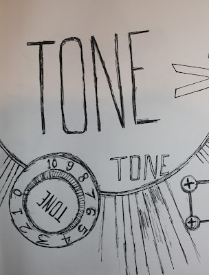
Once i had photographed my guitars i started to come up with other ways that i could record them. The images below are a few quick sketches and drawings i did of different parts of my guitars.


Continued line drawings always seem to add character to what could be a rather boring illustration. I sketched out the headstocks of my guitars using this technique to see what the results where. I'm happy with the roughness it creates but it makes the subject appear very naive.