Wednesday 16 February 2011

Final Hot Dog Fold

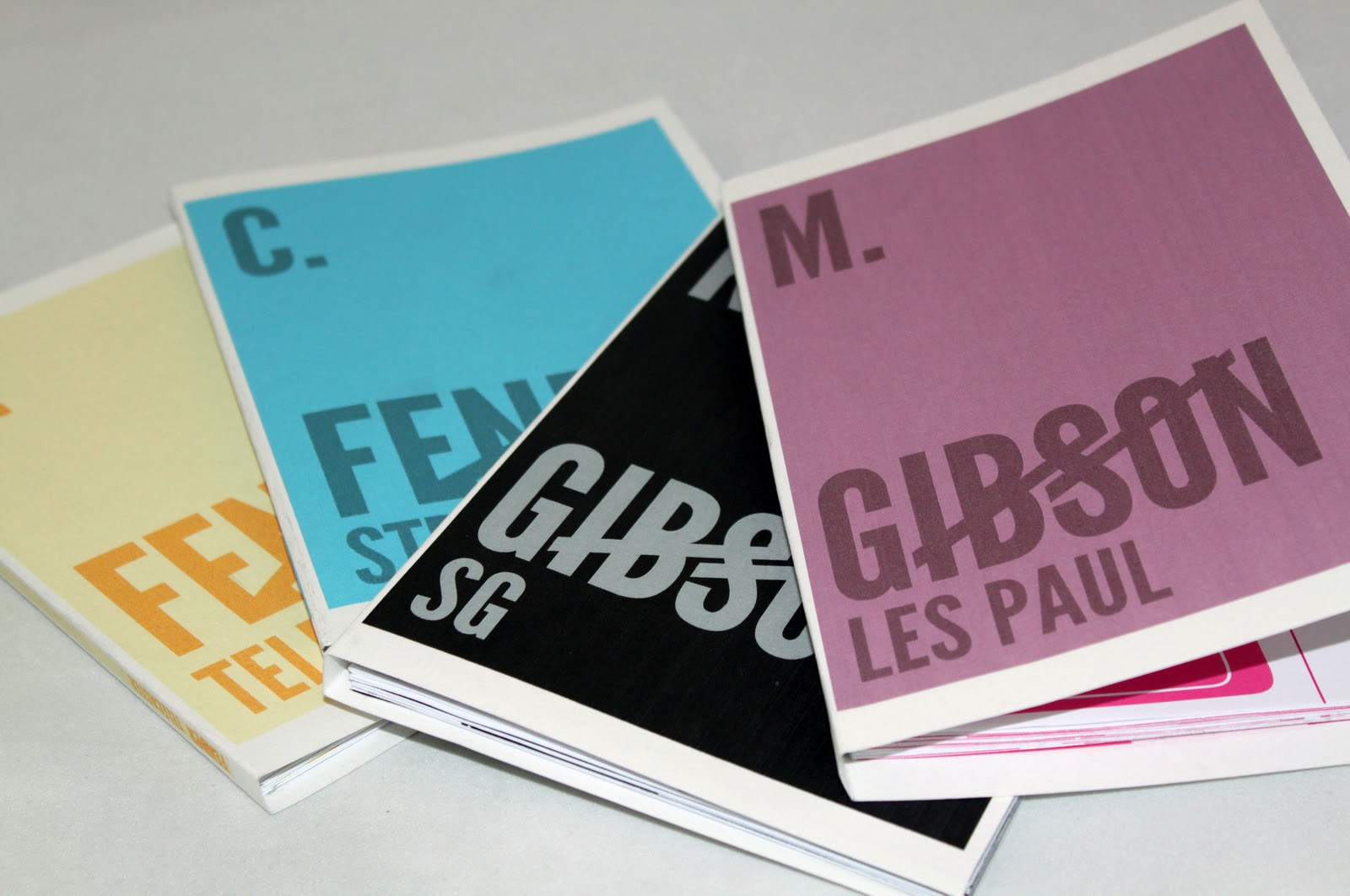
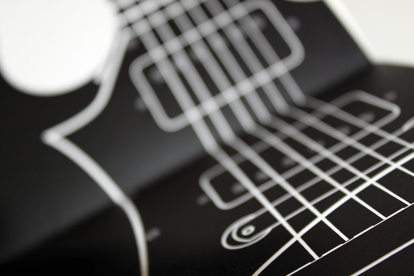
These are a few final images of my hot dog fold books, I was happy with my final result however some of the lines when working off illustrator didn't mach up when printed. I chose to use a sugar paper stock as i thought that using a one colour print would create the best result.


Hot dog Fold books

For the Leeds University book fair we had to design a series of 10 hot dog fold books to promote our work and experience selling our own products. I chose to create a a4 set of letter A's that were illustrated based on different themes. Theres nothing more i enjoy than drawing so i thought this would be a perfect opportunity to produce a piece of work that was solely related to my interests.  I wanted each one of my A's to be made up of lots of different drawings relating to one specific theme.

I came up with various different themes to work around and the images below show my progression to my final piece.

Ideas for themes:
Anatomy, 
Trainers,
Animals, 
Astrology, 
Architecture,
Graffiti,
Electronics,
Mechanics,
Engines,
Wheels,
Apparel,
Sci-fi,
Hair styles,
Nature
Faces
Urban,


Tuesday 15 February 2011

Collection of 100 Final Piece

After completing all my designs for the brief i went ahead at making my books, printing and binding each one following techniques I had learnt in my book binding sessions. I am very happy with my outcomes but obviously there are bound to be faults, that of which i will analyze in my evaluation. 

Cost to print: £13.25
Type of Stock: Regular 80 GSM matt paper (inner pages) Water Colour 280 GSM
Colours used: #49C7ED,  #EC008C,  #000000, #FFF0A5
Size: A5
Typeface used: League Gothic


Monday 14 February 2011

Collection of 100 Packaging

After producing my final designs i decided that i needed to concentrate on how i was going to present my product to my target market. I have come to the conclusion that building a box to house my books would be slightly too time consuming and not as practical as I initially thought. A box is usually used to contain something of mass, so therefore if i had say 6 or 7 books a box would be more appropriate. Instead i am going to produce a sleeve that slips round the books simply to serve the purpose of keeping them together.

I wanted the sleeve to be eyecatching but at the same time very simple and readable as its only there to house my books. Because each book cover is a different colour i thought it would be necessary to stick to using black and white rather than over complicating there visual appeal. 
I started by drawing a few ideas on paper of how i wanted my sleeve to look then i replicated them in illustrator, testing the sleeve design against my front covers to see whether the design worked. 


Initial Drawings


Illustrator Ideas


Outcome


Collection of 100 Developing my Designs

After being rather happy with my first mock up of my books i decided to move forward and create my other 3 designs in the same style. Below i have documented some of the techniques and processes i went through to get to my finished designs.

Fender Telecaster

Final Design


Artboards

A few examples of how I used my designs to layout the pages of my book. 


I changed my vector layout of the telecaster to a light yellow to stick with my CMYK theme, i then used the opacity tool to give the overlapping layers some depth.

Gibson SG

Final Design


Overview of Artboards


Individual Artboards


I tried to keep each double page spread as simple as possible but continuing onto the following pages so when looked at as a whole the piece flows as a whole.  When flicking the pages of the book this won't be as obvious but this is what i am aiming to achieve. 

Gibson Les Paul

Final Design


Overview of Artboards


Individual Artboards