1. What skills have you developed through this module and how effectively do you think you have applied them?
In terms of skills i have acquired alot of new methods of working and techniques within them. The one that sticks out the most is my use of Adobe illustrator, before i came here i didn't have a clue how to use it and now i think I've pretty much mastered the basics. I've developed in other areas such as understanding the principles behind graphic design relating mainly to our studies on type.
2.What approaches to/methods of research have you developed and how have they informed your design development process?
I used my design context blog as a way to mainly record my research, looking at current designers/illustrators/artists, current typefaces and in general things i thought would inspire my work. I found this a tedious at first uploading all my research to my blog but it worked perfectly when influencing my work as i had a easily accessible online book of my research to use. Other methods that informed my design development process was recording as much primary research as i could with my camera that way i could find things that influenced me and they didn't have to come from the library or from the internet.
3. What strengths can you identify in your work and how have/will you capitalise on these?
Judging my own work is definitely a task i need to develop but I would say my main strength is understanding how layout work. I often find that if i had a rubbish image and a rubbish piece of type you could always make it look visually engaging solely down to its layout. I would like to learn more about layout and the way type and image can be successfully mixed together.
4. What weakness can you identify in your work and how will you address these more fully?
The main weakness within my work is trying to get the ideas from my head down onto paper. Often i try and go with the first idea i think of, when instead i should be developing ideas further and further so the progression is structured and my outcome will be most likely much more effective.
5.Identify five things that you will do differently next time and what do you expect to gain from doing these?
-Keep up to date on my blogging so i don't have to add stuff near the end of the module.
-Manage my time a little better so I'm not rushing work near the deadlines.
-Become more creative with my work, I'm fed up of using computers.
-Gain influence from past designers not just current ones.
6. How you grade yourself on the following areas?
5= excellent, 4= very good, 3= good, 2=average 1=poor
Attendance: 5
Punctuality: 5
Motivation: 4
Commitment: 5
Quantity of work produced: 3
Quality of work produced: 4
Contribution of the group: 5
Sunday, 21 November 2010
Thursday, 18 November 2010
Illustrator Brief
For my Adobe Illustrator brief we had to create 26 variations of a letter form to show how we've experimented with the skills learnt in our Illustrator Inductions. I chose the letter K because i thought that it was a nice letter to work with unlike the letter "i" or "o." Below is a collection of my favourite manipulations i created.
No News Is Good News Mailshot
When i first recieved the brief i didnt quite know where to start as my previous newspaper article hadnt given me much freedom in routes i could go down. I chose the article about buisnessman James Caan attempting to buy a baby for his brother in pakistan. I wanted the mailshot to make people think and to inform them about something that would stick in their minds rather than just an everday article that people turn a blind eye to.
From the article about James Caan buying a baby i started to look down the route of child trafficking and how its an everyday problem that's growing and growing but we don't know the exact facts about it. Even though it was a bit of an extreme theme to go down i thought that it would carry on from my article nicely. I chose to make a mailshot that would be for parents, childrens hospitals etc and would be informative about how we can put a stop to child trafficking.
To start my project i began to produce some simple sketches and ideas in my sketchbook relating to folding options for my mailshot and how i could present my question "What is the price of a human life?"
I thought that for the front of my mailshot i could present my audience directly with my question to intrigue them. Below are a few experiments i did with the colour and type of my question.
After playing around with my type i really liked the idea of creating a message within my question. If i just highlighted singular words i could exaggerate on the point i was trying to make.
Below are a couple of digital experiments i did with type.
I carried on developing my work and coming up for ideas of packing and colour, I wanted my envelope to be simple rather than being fancy as the subject i was dealing with wasn't exactly fun. Instead i wanted my mailshot to consist of my envelope and question with an informative poster that folded out.
Ideas for colour
I experimented with lots of alternative colours for my envelope but found that the one that worked the best was the not so exciting dark brown colour. The white and red type really stood out and when i got feedback from other students the brown was the colour that was preferred by the majority of people.
Contacts
I needed to choose a list of contacts that were appropriate for my to send my letter out to. I originally wanted to send my letter out to current charities and foundations that work to stop child trafficking but i realized this wouldn't work because they're the people who don't necessarily need informing about it because they're doing their bit to help already. Instead I thought it would be a good idea to send my letter out to places like childrens hospitals and teaching foundations because in those lines of work often they're people who care alot about children. My list of 10 contacts;
National Union of Teachers
NUT Headquarters:Hamilton House, Mabledon Place, London, WC1H 9BD
Birmingham Children's Hospital
Steelhouse Lane, Birmingham, B4 6NH
Leeds College of Art
Blenheim Walk, Leeds, West Yorkshire, LS2 9AQ
St Lukes Hospital
Little Horton Lane, Bradford, West Yorkshire, BD5 0NA
Pinderfields General Hospital
Aberford Road, Wakefield, WF1 4DG
Trust Headquarters
Rowan House, Aberford Road, Wakefield, WF1 4EE
Leeds Parish Church
2-6 Kirkgate, Leeds, West Yorkshire
St Georges Church
Great George Street, Leeds, West Yorkshire
Rosebank Primary School
Burley Road, Leeds, West yorkshire, LS3 1JP
Allerton High School
King Lane, Leeds, West Yorkshire LS17 7AG
Wednesday, 10 November 2010
Colour Theory
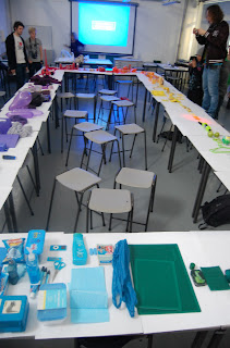
This week we had to collect a series of objects from our given colour to work with on Tuesday. I was green so I brought in items such as beer bottles, apples and anything i could find lying around. We firstly had a lecture with Fred learning about the firmaments of colour and how they can be used within graphic Design, this included learning about primary, secondary and tertiary colours.
Primary Colours- Red, Yellow and Blue. Theoretically these three colors can be combined to make any other color.
Secondary- Are produced by mixing pairs of primary colors. They are orange, green and violet.
Tertiary- A color made by mixing one primary color with one secondary color
After this we had to arrange our coloured objects on the surrounding tables so that they represented a colour wheel, colours opposite each other are complimentary colours. For example green was opposite red.
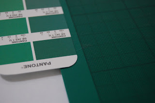
Afterwards we we taught about Pantone colours and were given some Pantone colour swatches to play around with. For £160 each I'm going to have to get saving.
With our green objects we then had to use the pantone colour swatches to try and find the exact pigment of colour that they corresponded to.
Wednesday, 3 November 2010
no news Is good News
These are some images of me currently working through my project developing ideas for my final piece. So far out of the series i have come up with a lot of ideas for the 'just type' poster.
Tuesday 2nd November
Today we played around with how letters can be represented in a 3 dimensional state rather than being as one solid piece. Our task was to pick a letter form and then create a version of it using 3 or more chunks over a scale of space. These we're our groups results.
This is a little film we made experimenting with the lift.
Other Examples;
Visual Literacy
Visual Synecdoche
This term is applied when a part is used to represent the whole, or vice versa. Quite simply, the main subject is substituted for something that is inherently connected to it. This substitution only works if what the synecdouche represents is universally recognized and understood, rather than taken at face value for its literal meaning. The ability to refer to a group or class of objects through a visual device enables a designer to convey an idea in a clean and unfettered manner.
Visual Metaphor
A visual metaphor is used to transfer the meaning from one image to another. Although the images may have no close relationship, a metaphor conveys an impression about something relatively unfamiliar by drawing a comparison between it and something familiar.
A visual metonym is a symbolic image that is used to make reference to something with a more literal meaning. For example, a cross might be used to signify the church. By way of association the viewer makes a connection between the image and the intended subject. Unlike a visual synecdouche, the two images bear a close relationship, but are not intrinsically linked. And unlike visual metaphors, metonymes do not transfer the characteristics of one image to the other.
Example;
Amsterdam.


