I want to keep each of my four designs unique and considerably different however to keep them consistent I've decided to use my logo I've created as a repeat pattern. This will tie all my pieces of packaging together.
I wanted to keep the net below as simple as possible as I thought the only product that it could house that would relate to my project is some sort of fold out leaflet or guide. I wanted to use a light grey stock when It came to print with my repeated pattern a darker shade of grey that it would fade into the colour of the stock. In the centre I decided that a more easily legible and readable logo would need to be placed, That way It would easily inform the user without them trying to depict the pattern I've made out of my logo.


Below are a few images of my final print out, I'm quite happy with my final result, I think the repeat pattern worked exactly how I expected. However I wouldn't mind using a series of different colour stocks but using the same design. I printed a few different versions of the design below and modified the positions of the logo in the centre, I found that having the logo in the bottom right hand corner looked much more subtle than having a huge logo in the middle.


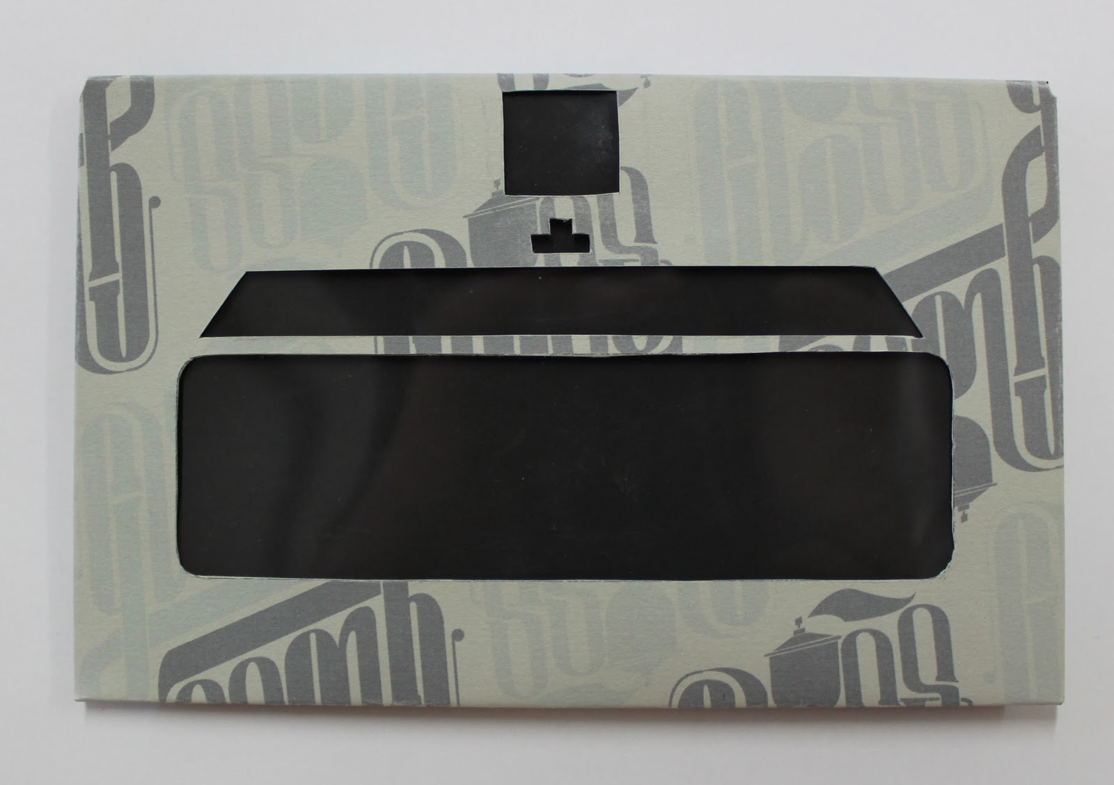
I thought the envelope net could be used to house my spray can cap guide, using the front as a see through window for the information to be seen through. I would achieve this by using acetate to create a little see through window in the shape of the top of a spray can. I thought this would be a good device to refer to what will be held inside.


This is my final print below, I think the acetate window will work well when there's content inside the envelope to present. I'm happy with the change in colour scheme, having the repeat pattern two shades of gray makes the package seem much more appealing.


No comments:
Post a Comment