Sunday, 13 February 2011

First mock up book- Collection of 100

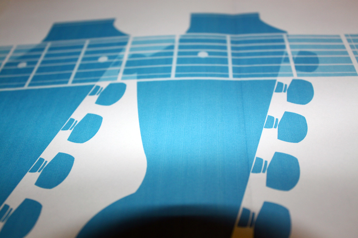
After drawing up all my designs in illustrator i decided to make a mock up of how my final book would look. Below are some pictures of how i decided to layout my pages in illustrator overlapping the vector guitar files that i had created.


These are 3 screen shots of the layout for 12 of my a5 pages. I designed each page on an A4 artboard so that when printed i could just fold each page without having to ruin the quality of the print by sticking pages together.

Below are some photos of my mini mock up book.


When putting my layout together in illustrator I changed the opacity of each of my shapes so i got a two toned effect when overlapping each image. I think this works well and is a theme i am going to continue throughout my books.


After making my mock up book i realized there was a few creases within my design that would need to be ironed out. Firstly when i realized how time consuming printing and making my book using a standard colour printer was I started to have doubts about how realistic it would be to screen print all of my 4 books.  Each book would consist of 25 pages and this would be repeated 4 times to get my 100. If each page is A4 and then folded into 2 this means i would have to screen print over 50 times to achieve what I had aimed at the start of my project. As screen printing wasn't practical at this stage i decided to print all my books digitally, this way i could save time when printing and produce a much more crisp finish using a selection of different papers

Other faults i came across when making my book was that the print didn't stretch out to all of the edges of the paper. This was a simple mistake to correct in the printing options in illustrator but due to human error my work had already printed out before noticing.

Otherwise i am really happy with my mock up and this has given me the motivation to produce my other 3 guitar designs ready to print and produce my books.

Developing ideas for my First book Collection of 100

I started to work on my designs for my first book which would be in Cyan and based on the Fender stratocaster. Below are some of my drawings of how i want my illustrations to be layed out when i re-produce them in illustrator.


After drawing up some initial ideas of how i wanted my guitar to look i started to produce my design in illustrator using block colours and the pen tool to create my shapes. Below are some images of my development. 


I finally layed out my design with some more illustrations of guitar related items (plectrums, tabliture and basic facts about the guitar. This was so that i had a solid layout for my silk screens.

Collection of 100 Developing my Packing and front covers

After developing my logo ideas i re-applied this format to my front covers i had previously made. I then started to draw up ideas for packaging my books. I want to create a small a5 size book box/sleeve that my books can slot into. 


This is my finished design for the front covers. I think that developing the text so that its more interesting to look at has definetly paid off. I think the Fender and Gibson Logos flow better when you see the series together. Below i have started developing ideas for how i am going to box up my books. 


I want the book box to be of a simple design literally just to encase my product, I feel that the box doesn't necessarily need to be amazing fancy or visual as the content of my books will be what appeals to people. Thinking from an business point of view in terms of getting peoples attention, if it was placed on the shelf of a shop The spines of the book would be visible informing the viewer what they're looking at.

VIEW FROM FRONT
-Box with four books coming out of slot section

 VIEW FROM SIDE
-Spines of each book


SIMPLE NET TO CONSTRUCT BOX


Collection of 100 developing my front covers

After getting a solid idea for the direction of my project, I started to get ideas for developing the front covers and packaging for my books. I wanted each book to have a continuing theme in rgards to layout and style so i wanted to find a typeface that would work with the titles of the 4 books. As i had chosen to do 2 gibson guitars and 2 fender guitars i started to develop the words "Fender" and "Gibson" for my front covers so that they were visually appealing and linked together well. 

Below are some picture of my sketches developing the words Gibson.


 I really liked the font League Gothic as it was very formal and informative whilst at the same time being easy to read. I wanted to use this font adding some modifications to the lettering to link it into my theme of guitars.


 Below is my final modification to my type. I used two blocked out lines to add more impact to the letterin, the lines are there to represent the strings of the guitar. Even though a regular guitar has 6 strings i found that using 6 lines was over complicating my design. By using just 2 lines and connecting them to certain letters i felt that it gave the type more of a musical link, the letter 'S' now could be associated with a musical bass clef.  I like this design because of its simplicity I would just now need to repeat this process for the fender logo.

Below are some pictures of the development of my Fender Logo.


I followed the same process for my fender logo as i did with the Gibson logo, i used two blocked out lines to add more of an impact to each letter.  I like the way the letters are all still very readable but it feels that they are more connected as a logo rather than just a piece of type.

Sunday, 6 February 2011

Design Process-Software Wokshop Photoshop Postcards

For the photoshop brief we had to create a series of 10 double sided A5 postcards to represent what we had learned in our photoshop sessions by manipulating our own photos.

At first i found it really hard to come up with an idea that would flow through the 10 postcards but when i got the ball rolling I managed to produce something that i thought was quite visually engaging.

I decided to base my postcards on one of my favourite songs. I chose to work with "While she sleeps'- Crows, I picked a section that specifically appealed to me then broke it down into just a few lines.

(listen to lines between)
1:23-1:36


Below are some pictures of my development of my postcards and my final results.

Back of postcard


Finals