Monday, 13 February 2012

IDENT TWO

My second ident similar to my first consists of the theme of being submerged. This time rather than using illustrations and type I want to use a selection of photographs. The first 2 seconds will seem like the viewer is watching a camera sinking beneath the surface of the sea, to float downwards and see the program information.


I found a really good piece of sound to use, that fits perfectly with the time lined sequence. I played around with a couple of filters in audacity to normalize the wave length and height of my sound clip then brought it across to use in After effects.


From 0.00 to 1.00 my video goes through a sequence of flashing images to create the effect of submerging. I collected a range of royalty free images, cropping and zooming in on aspects of them to get snap shots from above and underneath a wave. I used a Gaussian blur filter to create transitions from image to image as shown below.

I kept the point of interest at the same point throughout the first second but placed the images at different positions upon the z axis. Therefore some appeared much more blurry than others, adding to my whole submerging feel. 
I kept the time of each image being on screen to a minimum by shortening their duration, as you can see the very staggered staircase looking layout in my composition panel. In the last few milliseconds of each photo being on screen I lowered their opacity to allow the other images to blend into the frame.


 My video so far;


After this 1.00 second period the camera pans down the final image to reveal the national geographic logo in the distance. The camera logo then changes position and starts to head towards the camera eventually going past viewpoint by 4.00 seconds. Screenshots can be seen below.


IDENT ONE NEARLY COMPLETE

I'm nearly complete with my first Ident, this has definitely helped to formulate ideas to the composition of my three to follow. Before hand in I might make some minor changes but At the moment I'd say my video is 99% complete.

IDENT ONE...Development

My main idea for my first Ident is to follow the perspective of a deep sea diver, swimming to the bottom of the sea bed only to discover the National Geographic Logo and program Information. Some of my drawings and Ideas are shown below.


So far I've got to the stage below. I created the bubbles using mutiple white layers of circles drawn in photoshop simply moving each layer upwards whilst from side to side to create a bubble like effect. This was the most lengthy process as creating realistic characteristics of bubbles is hard to get your head around. I felt just using the 2 colours dark blue and white kept the video simple and to the point.

I created the bubbles in staggered layers up to 3.00 seconds then by 3.20 the opacity of these layers are reduced to 0%. Whilst this is happening a much smaller layer of bubbles starts to come on screen, these have a 100% opacity so are very apparent to notice, the aim being your attention is dragged downwards to the diver below.


After this section The diver comes into frame, I want this to be a really smooth movement to communicate the fact that he's floating. The orientation of the X axis slightly between seconds 4 and 5 worked well to make it appear like his legs were begging to float above his body almost.


My video will then start to revel the National Geographic logo and the program information as the diver pans off screen. I want my type to float to the centre of the frame then travel towards the camera on the z axis. Progress can be seen below.


I've started to put together my other type layers keeping them as simple as possible, as I think with too much movement the information will become unclear. I want the type to follow the same stages as the National geographic logo staying on screen for a slight pause then heading towards the viewer. A few screenshots below show the stages I'm at so far. Selecting cast shadows from each 3D layers material options worked so well in adding depth to the type coming towards the screen, beforehand I had trouble centering the light and It hadn't worked as effectively as I'd hoped.


Below is a video of my final clip with no sound. The soundtrack is some scuba diving sounds of Underwater breathing that I'm yet to render with. I'm not to happy with the panning in and out in the first 5 seconds, I don't think It has been successful as I originally thought. You can see from the screenshot below that the spacing of the key frames are far too close across the shorter period of time, To resolve this I think I might just have a slight increase from 0.00 to 5.00 In the z axis of the camera. Slowly panning backwards before the diver and the text start to appear.


Video so Far;


I've made a few amendments to the camera angles throughout the start and so far my video is up to the stages below. I've noticed another small error. The diver layer has a small hairline in the top left hand corner which is where I've been using my graphic tablet and most likely drawn a line I've not acknowledged because of how white it is.


Top Ten Typefaces....

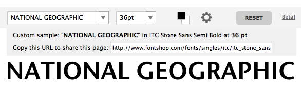
Within my 60 second composition I have come to the conclusion I am Going to use the tyepface Erbar, but within my Idents I feel that the height of the letters really doesn't fit with the national geographic logo. The closest comparison I can get to the National Geographic Logo is ITC stone Sans Semi Bold as shown below. I have come to the conclusion to use this typeface across all of my Idents and to use Erbar solely in my 60 second Composition. 


Sunday, 12 February 2012

Top Ten...Media Experiments

I need to define a style to work in across some of my 10 second idents and my 60 second title sequence, So far I've been working with mainly black and white images and light blue type. My main concept for a final colour scheme excluding photographs is below.


A few idea's for digital collage are below, something I need to develop a bit more;


A few other ideas I'm developing;


Top Ten....Ink and textures

Most of my research looks at videos that are very layered and textured, built up by a combination of masks to add depth to what you are viewing. Within my work I want to use moving layers on ink to communicate my subject matter of being underwater, I think that ink and liquid is instantly recognizable because of its characteristics. Below is a few scanned textures I've been putting together using quink ink, bleach and water. When you apply a layer of water before applying the ink, it gives the ink a surface to disperse across making lots of interesting patterns.


After scanning in my different ink samples I started to edit them in photoshop quite simply just using the threshold tool and colour overlays to flatten out the layers ready to start working in After efffects.


Since playing around in Photoshop with the ink Layers I've created I've moved across to after effects creating simple movements with just mask layers and a camera. Slowly revelaing each ink layer as if they were flowing across the screen. Results are Below.