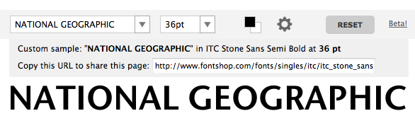
Within my 60 second composition I have come to the conclusion I am Going
to use the tyepface Erbar, but within my Idents I feel that the height
of the letters really doesn't fit with the national geographic logo. The
closest comparison I can get to the National Geographic Logo is ITC
stone Sans Semi Bold as shown below. I have come to the conclusion to
use this typeface across all of my Idents and to use Erbar solely in my
60 second Composition.


No comments:
Post a Comment