
I started to play around with a bit of branding for my book, keeping things simple using some clean vector shapes and Helvetica Bold with a tight kerning. I chose to call my book Hexagon, sticking with the simplistic theme I thought this would be the most obvious title to pick, plus as a stand alone word it I think it leaves the viewer to assumption. I wanted to incorporate the hexagon shape into my Logo, purely so it was much more interesting to read, below are a few of my experiments.
I found that 2 hexagons with the same line point as my typeface imitated Helvetica's X rather well, so much so that it becomes unnoticeable, but with a second gland you notice the angles of the hexagon creating the X shape, almost like a figure of 8.


I experimented fading the Hexagon shapes into the letters either side, however I don't feel this was necessary and the word itself read better as a series of solid black characters. Below are a few experiments arranging my logo on a front cover. So far I plan on making a 16 page book with facing pages, kind of like a mini zine, exploring the hexagon, therefore on my front or back cover I want to explain the reasoning for its creation with some sort of blurb.
Again working with the hexagon, I explored a series of pattern repetitions in Illustrator, attempting to develop some visual content for the front cover, but still remain with my clean linear approach. Below are a few screenshots of my experimentation with layout In Indesign, I think the most proficient covers have a bigger amount of white space, attracting your eyes to the title. Alike to my title and the general theme of my book, I wanted to create another sort of clever illusion with the visual content. I tried to make a series of hexagons arranged to form another hexagon in the middle, I think this becomes more apparent when looking at it second glance.


I added some details about the book in the top left hand corner of the back cover, explaining my visual exploration of the hexagon and of course an email address, that's if anyone would want it haha.
I then created some double
page spreads, Initially I was really chuffed with the designs below as I
thought when printed across two pages the design work well over a
larger surface area. However when printed they just looked too busy in comparison to the title and the approach I was aiming for, I definitely think the simpler the better. I want people to cross fingers pick up a copy and at least have a flick through, that's not going to happen if they're bombarded by things to look at.


Below is some more screenshots of the arrangement of my book. I chose to mix things up a bit in terms of style, working with both hand drawn imagery and halftone Photoshop collage. The Images don't have a message behind them, but instead explore the hexagon as a frame, I wanted to show how different images work together to create tone, rather than being viewed individually. I tried to keep all consistent by treating each double page spread alike to a pull out poster, In the hope that if they do get sold they might end up pinned on someones wall somewhere.

The page above is going to be my middle page, a triad pull out poster of one of my illustrations.


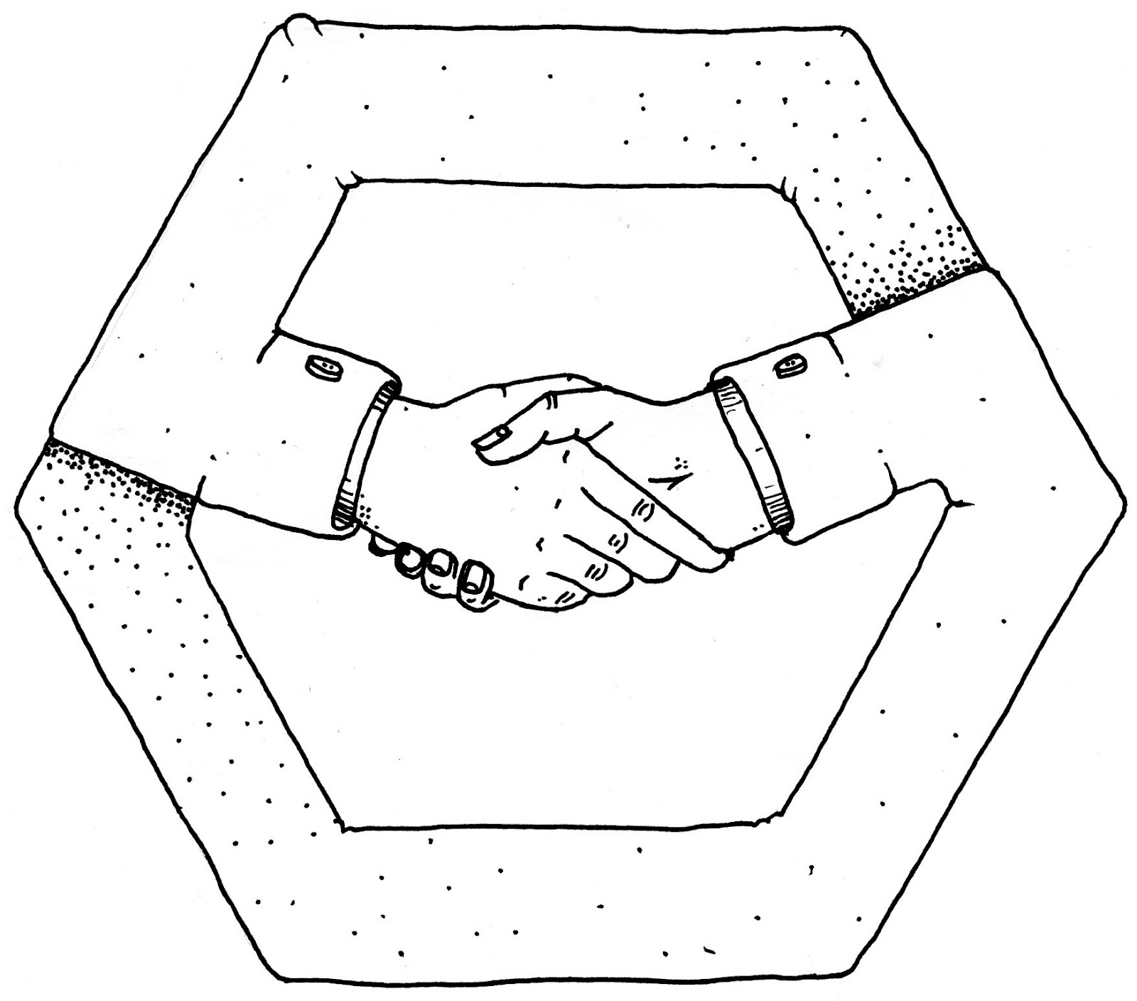
The illustrations below started as a doodle from some of the collage I've been working with previously. Recently I've been looking at a lot of Salvador Dhali and M.C Esher, I guess this has got me thinking about perception and visual illusions. I wanted to turn the hexagon into a continually flowing shape, without a start or finish, I Incorporated the hands because its a subject matter anybody can relate to. Hands are very suggesting and when viewed on their own we often associate moods, gestures, situations, with the positions they're in. I tried to give each hexagon a different theme, reaching out, shaking hands, grasping arms, and saying ok.


Below is another Illustration I did experimenting with hexagons, I kept with the theme of hands interweaving different sections of the shape into 3 sets of arms. I'm so happy with the way it's turned out, My drawings usually aren't very consistent.

One of my earlier sketches, I had an Idea to base each heaxgon around war, peace, love and hate, but drawing guns and people kissing was just over complicating the message I wanted to portray.

I started working with collage, collecting Images out of old books in the library, Even had a fish around in the waste paper bin. Arranging images on a page, I used a black hexagon as a frame to see how different images worked with each other with the boundaries of the hexagon.


Below are the images I put together for the inner sleeves of my book, Again sticking with the theme of how the imagery works as a hole rather than individually. These will be arranged over a double page spread then viewed through a cut out framed piece of black card.


Below are my initial drawings and sketches of how my pages would fit together and how the content of my book would flow from page to page. So far I want to make a 16 page booklet with a black inner sleeve, 2 of the pages will be illustrations and the rest digital collage.


Problem Analysis


No comments:
Post a Comment