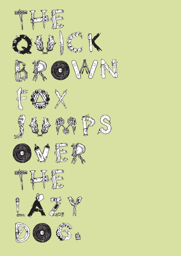
After separating out each one of my characters, I began to work my
typeface on a whole, producing some Ideas for my final posters. Below is
some of my experimentation, I feel like overall there are a few tweaks
to some of the letters that I would like to re-draw and re-make.


I then went onto using some colour to bring my typeface to life a little bit. Having a solid white backdrop doesn't give them any definition, I think sticking to my 4 colour scheme and working around the contours of the letters will add much more depth and make them stand out on the page when printed.


Other colour ways;


I'm reasonably happy with my results so far, I think I just need to
finally decided on the format of its presentation. As I will be making a
publication to explain each typeface I decided to create a repeat
pattern/cover page that would fit in nicely with the aesthetics of my
typeface.
I think this would look really crisp printed onto acetate or tracing paper, possibly as an inlay sheet for my publication or even as part of my posters.
I think this would look really crisp printed onto acetate or tracing paper, possibly as an inlay sheet for my publication or even as part of my posters.


No comments:
Post a Comment